
Hey bookworm friends! It’s been a while since I took part in a TTT post but I miss these more social posts! Today’s TTTopic is really fun because it has to do with typography on book covers. According to Merriam-Webster, typography is: “the style, arrangement, or appearance of typeset matter”. So I’ve chosen to highlight book covers from my TBR where the style, arrangement, or appearance of the letters feels specific to the tone or theme of the book. The typeset that, to me, feels like it’s helping to tell the story before I’ve even opened the book. Here are my Top 10 Covers That Feature Unique Typography (From My TBR).
Link-ups

Top Ten Tuesday is hosted by Jana at That Artsy Reader Girl. Don’t forget to check out her post and link up!
Covers That Feature Unique Typography
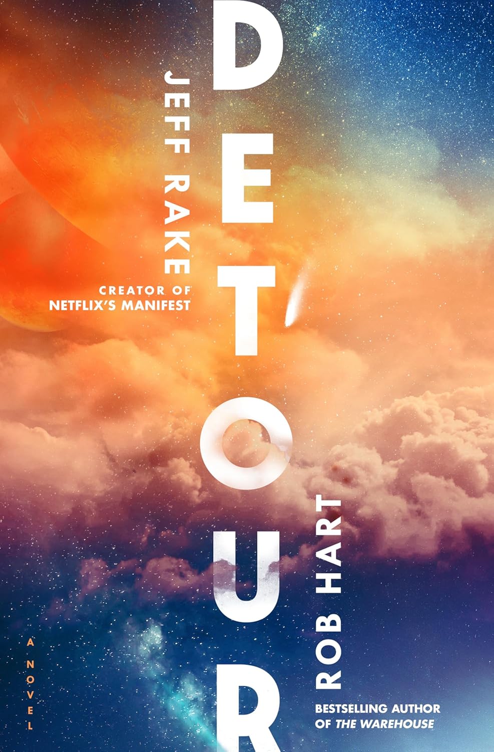


1. Detour by Jeff Rake, Rob Hart
2. The Story of Art Without Men by Katy Hessel
3. Songlight by Moira Buffini
4. Sunward by William Alexander
5. Saltswept by Katalina Watt (is on my anticipated release list for Feb)
I definitely did not pick three single S-word titles and two covers with ships on them on purpose! 😝


6. The Crack at the Heart of Everything by Fiona Fenn
7. Bone of my Bone by Johanna Van Veen (Out in May 2026)
8. Stay Buried by Jennifer McMahon (Out in Aug, 2026)
9. Midnight Rooms by Donyae Coles
10. The Secret World of Spiderwebs by Jan Beccaloni
Turns out I have a lot of books that aren’t even out yet in this list but their typography definitely stood out to me!
Let’s chat in the comments!
Which of my picks did you like the most? Or, If you participated in TTT this week feel free to share your link with me 🖤
These are all very different fonts! My favorites are Stay Buried and Saltswept. And I’ve read Detour and the typography is perfect for the story😁
I’m really looking forward to reading both Detour and Songlight. Great picks!
I agree, I’m super excited about both of those! Thank you :D!
I really love the typography for Stay Buried as well, the fact that the T looks kind of like a nail is so creepy. And I love that Saltswept looks like it’s literally being swept away! haha Glad Detour matches the vibes of the story!
Omgosh, you’ve chosen covers with such awesome typography! 😍 I haven’t heard of a lot of these books but seeing these covers make me want to at least add them to my TBR immediately, haha. Great picks!
Thank you, Dini!! Well it seems to me those covers did their job well then 😜! hehe
Songlight has an exquisite cover!
It really does, that turquoisey-orangey colour combo is one of my favourites!
I love the typography of Spider Webs.
Yes, letters made out of spiderweb, so clever!!
Great list! I especially love the way the typography looks for Detour.
Thank you, I really love the choices the designer of the cover made for Detour, too! 🙂
Ooo the Spider Webs is perfect!!!
Right?! I thought that one was so cool! 😀
Oooooo, these are beautiful!! I love that cover for Saltswept! You can’t go wrong with a cover with a sail ship on there!!!
Happy Reading!! <3
Thank you, I think so too!! 🙂 And I agree, I do love a cover with a ship on it haha! 🙂 Thanks for visiting my blog, Lin!
I really like Sunward
Thanks for sharing your #TTT
Oh I’m glad to hear you liked Sunward, I’m so curious about it! And thanks for visiting my blog 🖤
Great picks! I really like the typography for Detour, and the cover/image is very cool too.
Thanks so much! Yes, the typography for Detour seems to be quite popular and I really love it too 😀 !!
Yes, I like how you said the typography helps to tell the book’s story. So true. It’s wonderful when all of the elements of a book – cover art, typography, story, etc.—work together so beautifully.
Happy TTT (on a Thursday)!
Susan
http://www.blogginboutbooks.com
Thank you, I appreciate that! 🙂 I agree it’s great when all the elements come together with a cohesive message. Thanks for visiting on a Thursday, sorry for the late reply!
Some very pretty covers! I like Saltswept and Songlight the most.
Thank you and yes those are so gorgeous!
Excellent choices. I like Spider Web and Stay Buried.
Lynn 😀
Those are some of my favourites as well! Thanks :D!
Oh I love that cover of Saltswept!
I’m so glad you love it too, it really is stunning!
Great choices for this prompt. I love how the clouds cover the letters in places on Detour and love the lettering on Sunward. I’ve never seen that cover for Songlight but its stunning too 😍 I love the arrangement of the font on B Of My Bone and the spider web font is just perfect, as well as how its arranged within the web. Now I have to go look three of these titles up 😂
Thank you, Charlotte 🙂 I love the clouds in Detour as well as all the other details you mentioned too, they’re all so cleverly thought out! 🙂 heheh